Hi everyone!
You may have seen this “ticking off” video on my Instagram already, but I wished to share it here too and give a bit more background to some of the goals. 🙂
My goals for 2024 were…
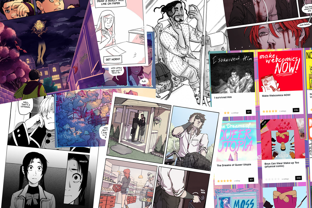
- Create interesting content for Patreon. My Patrons will be the final judges, but if the content was nothing else, it was interesting. :’) Check!
- Read a lot. Check!
- Take more visual notes. Well, there was an increase from 2023. Check!
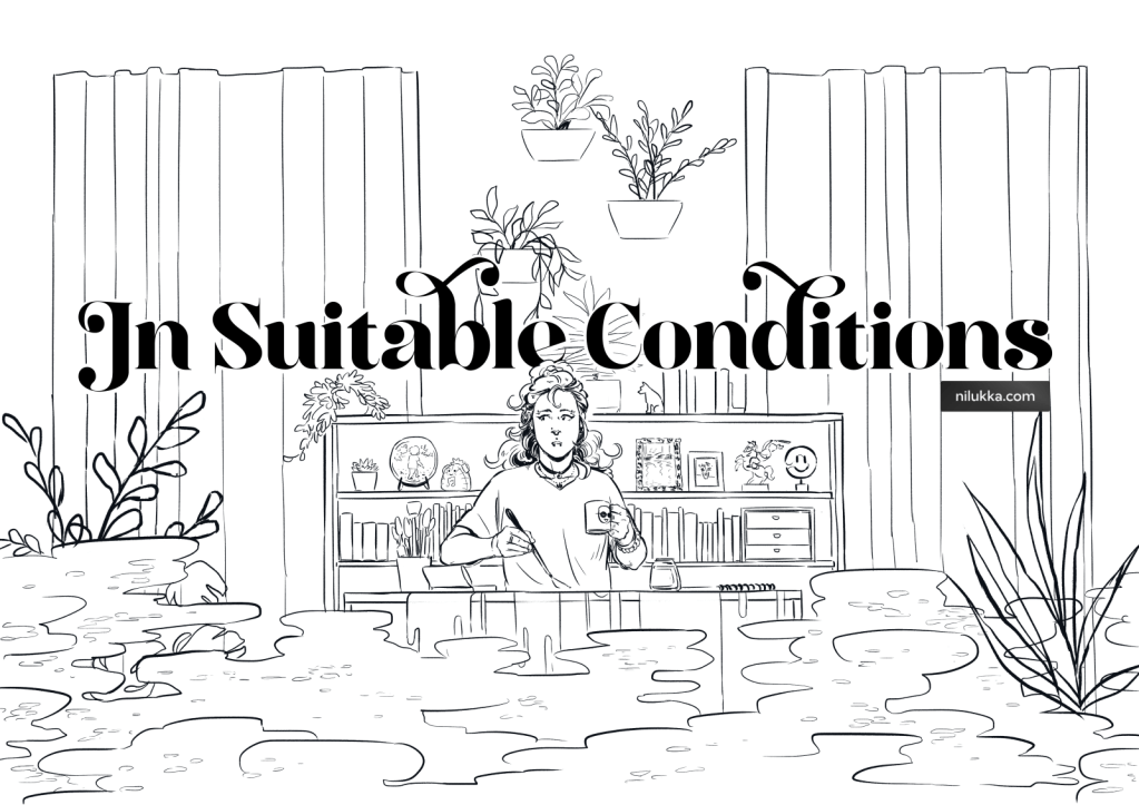
- Finish writing and start drawing and publishing my new webcomic, In Suitable Conditions. Check with love!
- Participate in collaboratory comics projects. Did not happen, unfortunately. Maybe in 2025!
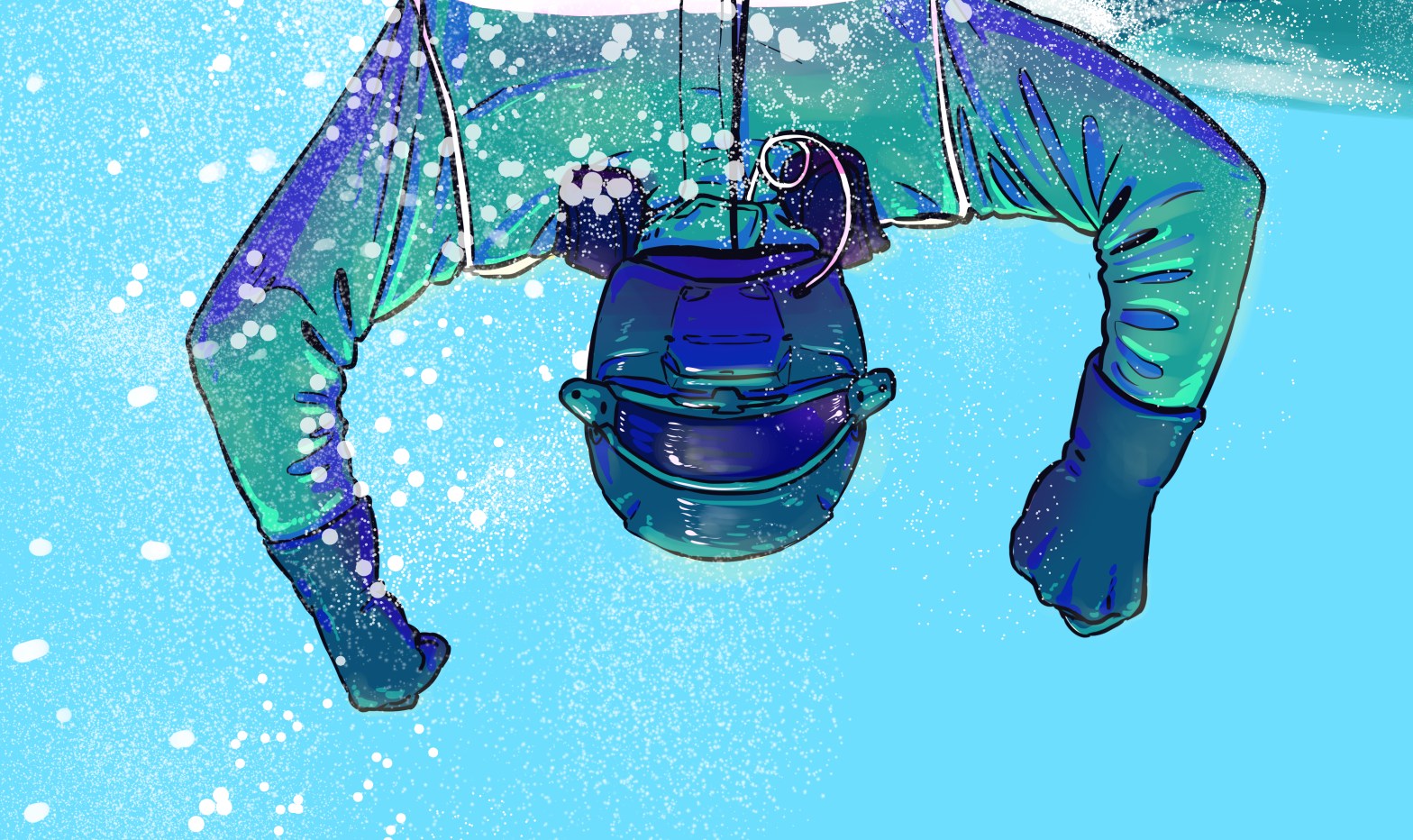
- Draw cartoons or comics strips of my daily life, at least 2/month. I only drew 22, so narrowly missed this one!
- Extra: Incorporate comics in my day job. It wasn’t what I imagined, but I tried and it counts. Check!
I hope you’ll enjoy reading this review. Let me know in the comments if any of the points in my musings resonated with you!
—-
Read more
I used to read A LOT as a child and teenager, but the older I got, the less I read. The first reason was an identity crisis of sorts: in my early twenties, I felt that adults are not supposed to read genre fiction. Adults are supposed to read non-fiction, world-classics, and some high-brow fiction that win awards, I thought. And because I had read predominantly fantasy until that point, I didn’t know what to read and what kinds of books I’d like. So I tried to read stuff that I randomly picked up at the library, didn’t like it, and eventually stopped reading.
I did find the joy of reading again a couple of years later, after learning that adults can indeed enjoy a variety of genres. But then The Phone and Apps entered my life. And we all know what that does to your concentration. But during the last two years, I have actively decided to hold a book instead of a phone, and I’ve regained my ability to focus – and enjoy – reading.
Patreon content
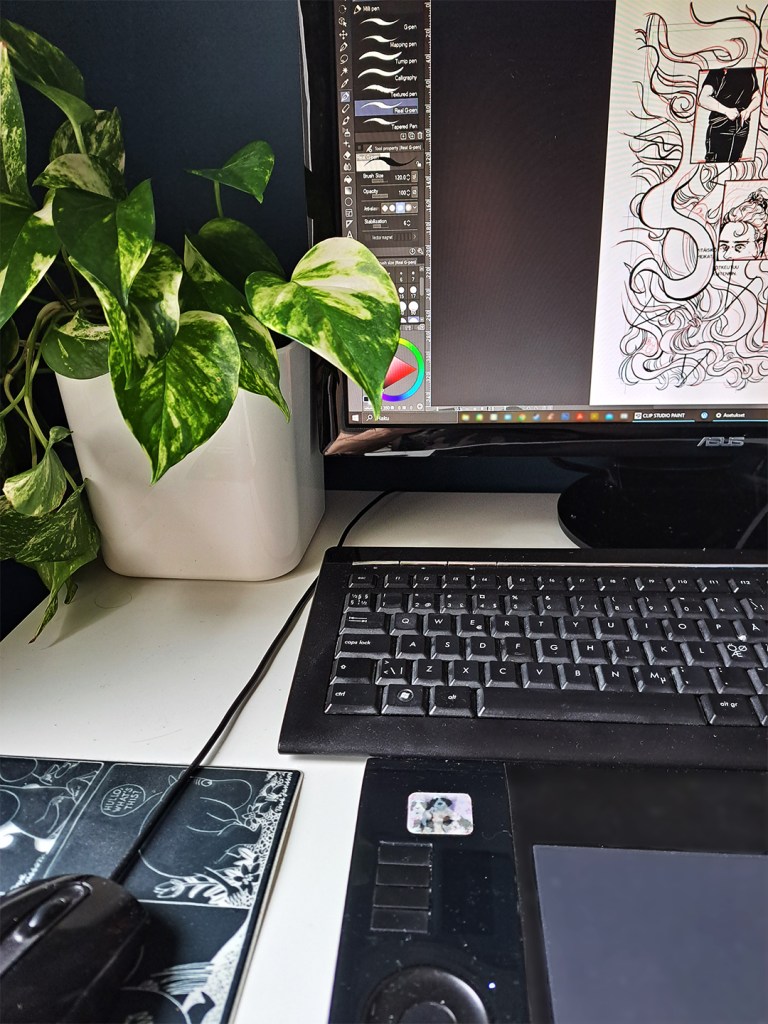
In 2024, I introduced new “making-of” content on my Patreon: audio diaries and walk-throughs/behind-the-scenes of In Suitable Conditions. The purpose of both formats is to tell Patrons what are the things in my mind and life that influence the story and style of the webcomic.
The audio diaries were an interesting experiment, but I think none of us particularly enjoyed them. :’D Not me making them and, according to metrics, not my Patrons listening to them. If I kept at it, I could get better at talking to a microphone, but right now, I’d like to spend time on other things. Such as drawing and creating drawing videos.
The illustrated walk-throughs emerged as a replacement for audio diaries when I figured that drawings might be more enjoyable both for me and for Patrons. I’ve published an example for all free and paid members to view here. (Normally they’re available for $3+ members.) I intend to share these walk-throughs for the foreseeable future. 🙂
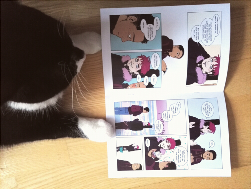
Finish writing and start drawing and publishing a new webcomic
My main goal for 2024 was for In Suitable Conditions to see the light of day. I must admit that I haven’t finished writing the comic, but I know enough of the story to draw it. :’) I’m probably going to approach the writing process as I did with BSandL: I write an entire arc and the plot turning points, then I finish drawing the arc before writing the next one.
I’ve learned that it’s difficult for me to write a script in text because I miss so many important things (beats, details, story logic) when I can’t see the story laid out as a comic. So, nowadays I have a rough outline of an arc and chapters written down, and then I proceed to sketching a chapter. After the panels and the scenes are in place, I add dialogue. This visuals-first process works for my personal projects, but I assume that if I were writing a comic for someone else, I’d have to learn to write the script in letters. 😀
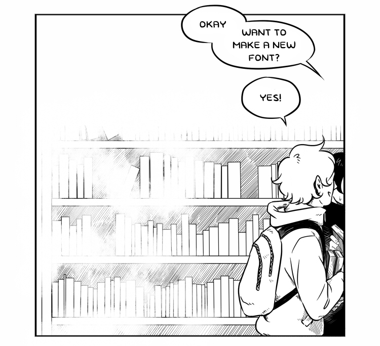
Take more visual notes
I’m a visual learner, and often it’s difficult for me to understand e.g. a process without creating a graphic representation of it, with arrows and boxes and so on. I know I’m not alone in this, so if I just took the time to take visual notes and create graphs of projects, timelines etc., it would benefit me a lot especially at work. Besides, when you draw a flowchart, you can start finding the faults in a process…
Extra: Comics in professional life
My day job is in marketing, and I’m quite intent on finding ways to use comics in professional content production and communication. There are some problems to solve though: Firstly, my own organisation does not completely agree that comics would be an appropriate medium for marketing, so I have to first use comics in a project to showcase their usefulness. But, and as the second point, even though both my colleagues and I may have ideas for comics, I don’t have time to produce them myself and there aren’t any resources to hire another comics artist to create the comics.
It would be wonderful to employ an artist to take visual notes at e.g. one of our events or to visualise a complex topic. It would help clients understand the topic(s) and distinguish the organisation brand.
What about 2025?
In Suitable Conditions will remain my main project for 2025. I hope I can stick to it until the end. It’s just that I don’t know how long the story will be and how long it’ll take me to finish it. And I don’t know how much its success will determine its fate – if it won’t garner enough subscribers on Tapas and Webtoon, will I feel inclined to abandon it? At this point, that feels unlikely because I don’t have any measurable goals for the comic. If it becomes successful, that’s great. If it doesn’t, that’s ok.
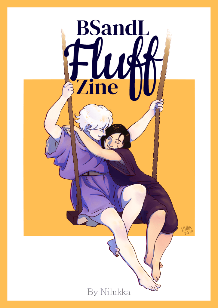
(I have to admit that I wish for a similar success as with BSandL. My hope for BSandL was to get 1,000 subscribers on Tapas, but over 10,000 people subscribed to it both on Tapas and Webtoon. That was nice.)
Basically, my goals for 2025 will be the same as for 2024 but with a different emphasis. I’d like to create more content about art both on this website, Patreon, and social media, but it’s difficult to find the balance between creating art and creating content about creating art. I’ll return with a new post about 2025 goals, so stay tuned to find out how I intend to solve this issue. 🙂