
Since I love typography and lettering, and for some people, reading my reasoning behind my typographic choices may be interesting, I decided to make a post about it. If you’d like, I can write about typography whenever I create something new!
This time, we’ll look at the typography in the BSandL Fluff Zine (available on gumroad.com/nilukka).
(If you want to learn the basics of typography, this’s a great page: https://material.io/design/typography/understanding-typography.html#) (Suomeksi esim. https://mycourses.aalto.fi/pluginfile.php/614938/mod_resource/content/1/Typo%20III_4_Sana_low.pdf)
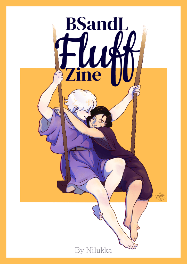
- Front cover title (BSandL, Zine): DM Serif Display Regular, 60 pt.
- Front cover title (Fluff): Cookie Regular, 190 pt.
- Front cover (By Nilukka): Adobe Ming Std L, 24 pt.
For the title, I wanted something… soft. Something that flows effortlessly like a light fabric or a dancer’s arms and hands. A calligraphic font. For a while, I even considered drawing the title myself, but it would’ve become too laborious. So, the search for the perfect font began! It took quite a while because most fonts I tried were too much this or too much that, but eventually, I settled on Cookie. Cookie is bold and soft but it also has a lot of variation in line thickness; I think it looks just beautiful. And look at the ligature ff! ❤️
At first, I was going to type the whole title with the same font, but after experimenting a little, I noticed that it eats away the soft effect; the title became too monotonous and hard to read. So, in the end, I decided to keep only the text “Fluff” in the calligraphic font and chose another font for “BSandL” and “Zine”. From the beginning, I knew it’s probably going to be a serif font because it adds to the elegant, flowy feel. The look could be described as feminine: you know how the logos of women’s magazines often have a serif font that has very strong variation in line-weight? Like Elle or Vogue. And Cookie is very curvy which is also associated with femininity. To accompany Cookie, I found DM Serif Display, an example of a neoclassical typeface. It’s soft but also classy and dramatic. Just look at the ball stroke in it’s “a”!
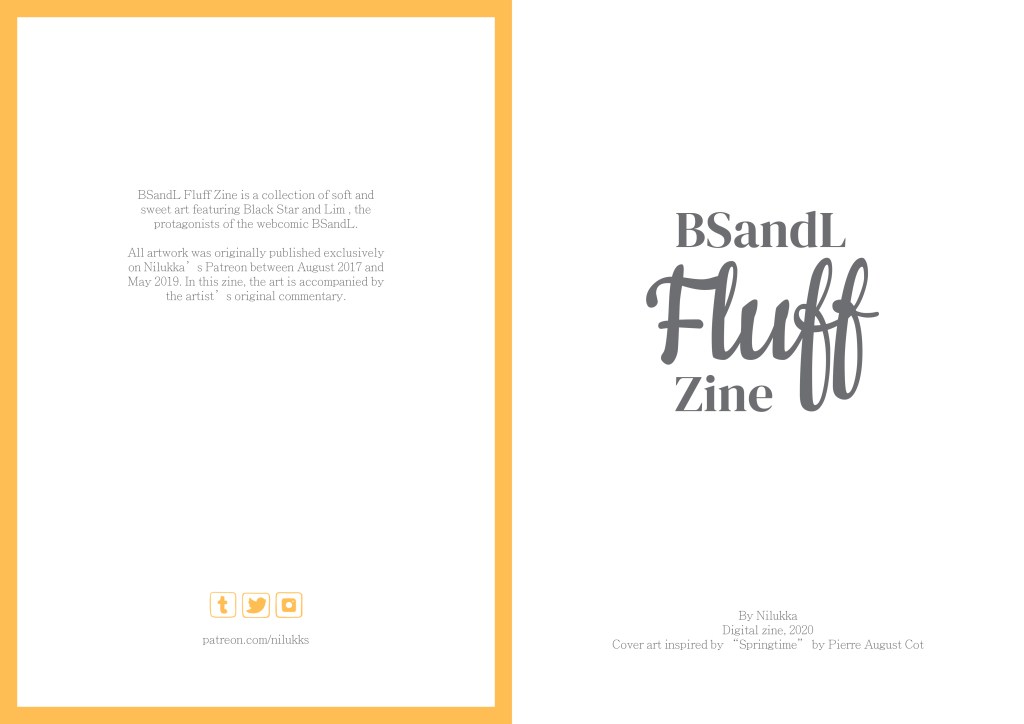
- In-cover paragraphs: Adobe Ming Std L, 14 pt. Leading 16,8 pt.
Since I’m already using a serif font in the title, I wanted to use a sans-serif or slab-serif in the actual paragraphs. A natural addition to the elegance of Cookie and DM Serif Display was a thin or light-weight variation. Hence, Adobe Ming Std.
Also, it seems like I typoed my Patreon address. It reads “nilukks”. Oops.

- Heading: Cookie Regular, 56 pt. Leading 48 pt.
- Paragraph: Adobe Ming Std L, 12 pt. Leading 14,4 pt.
Adobe Ming Std is not perfect, for example it leaves that weird gap between the single-quote and “s”. But in general, it looks nice with the Cookie-headings. I decided to use Cookie in the headings too because the headings had to look soft and fluffy also. That’s the point of this zine, after all!

In my opinion, Cookie looks the best in very short titles, 1-2 words. But it’s alright in longer titles also, as in the above examples. Or maybe it’s the environment I’ve put it in that makes it not work…
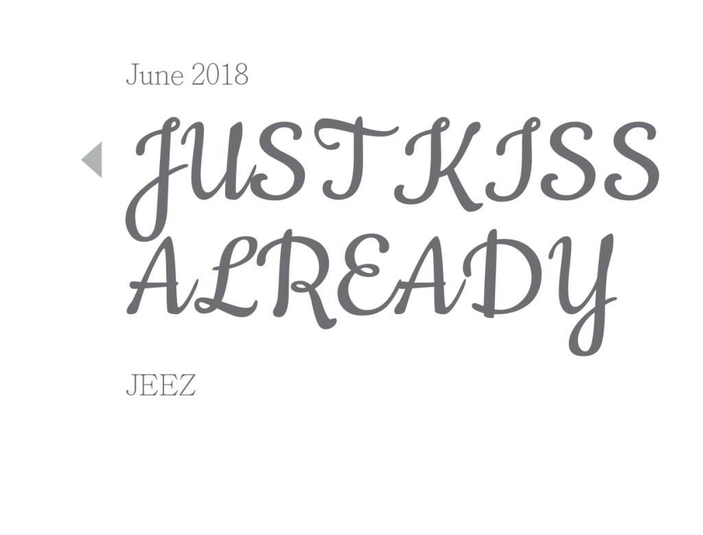
Obviously, Cookie is not intended for all-caps text, but I like how weird it looks here. It’s the contrast: a sophisticated and soft font used to indicate loudness and passion.
This post was originally posted on my Patreon.
Eelis Nilukka is a comic artist from Finland. His most well-known works are webcomics BSandL and Summertime and a short story Boys Can Wear Make-Up Too.
