
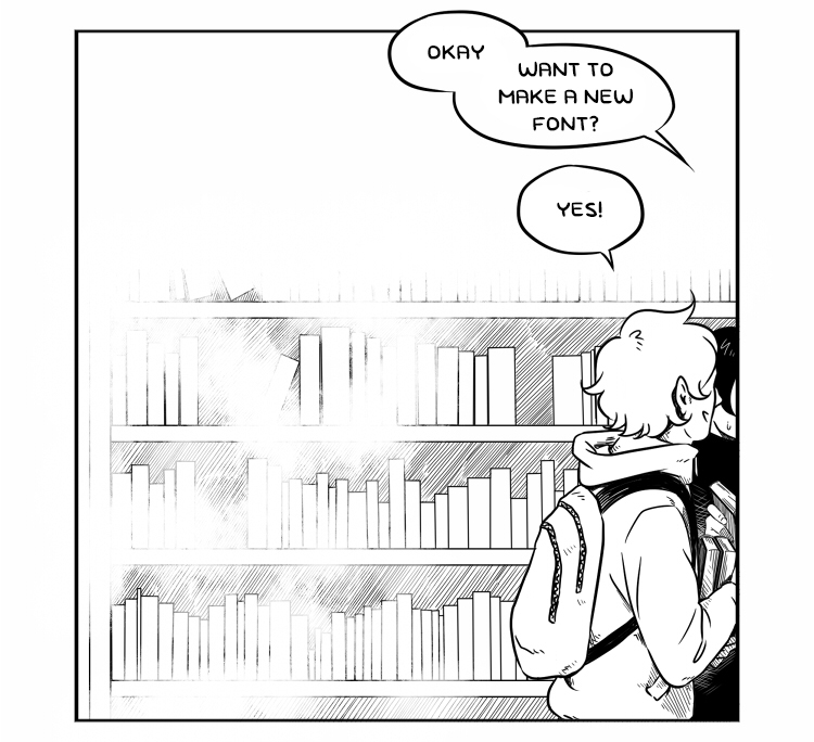
For some time, I’ve been considering updating the handdrawn font I use in my comics. It’s missing a few characters that would come handy when typing the speech and thoughts of characters, and the overall look of it could do some refining.
Since some people have been asking how I made my font and are considering creating their own, and since I now have this website and blog, I decided to write a post about the process of updating the font!
Before we begin, I’d like to point out that I’m not an expert in typography or comic lettering. Sure, I am a graphic designer and I am a comic artist, but that doesn’t make me an authority in this matter; these are simply my observations, and if you’re just learning about typography or lettering, you should get acquainted with other resources also. (For example this and this.)
1. For starters
I made my original font, which I named simply Sarjisfontti1 (‘Comicfont1’), on Calligraphr.com. Their process is very easy and you don’t need any particular skills in font design to create your own font, so I decided to use that for the updated version too.
In the images below, you can see what the original font looks like, both in English and Finnish. I make my comics both in Finnish and English, so the font has to work in both languages. On the right side in the images, the text has a slightly larger leading which I’ve used in the latest (at time of writing) chapter of my comic BSandL. That’s another issue I’ve noticed in the speech bubbles in my comics: the text is too crammed which decreases readability. Increasing the leading fixes that problem.


If you don’t know how Calligraphr works, here’s a short primer. First, you create a template by adding glyphs (upper- and lowercase letters, numbers, etc.) from different language and character groups. Second, if you want to remove a glyphs, you can do so by clicking it in your list. Then you download the template and either draw the characters digitally or print it and fill the template with a pen(cil).
The free version allows you to use 75 glyphs in your template. For English, this is quite sufficient because you can add all basic upper- and lowercase letters, numbers and some special characters, but since I have to add six extra letters for Finnish (ä, Ä, ö, Ö, å, Å), I have to be selective and, sometimes, a ruthless executioner.
2. Draft 1
As I mentioned earlier, I’ve had some problems with Version 1. Firstly, I’ve come to realize that having the comic-style serif “I” would vastly improve the legibility and readability of text. Secondly, the font is missing a few, ahem, crucial special characters, such as parentheses (), the slash /, and the at sign @. This is a problem because I am a modern person living in the digital era of anthropocene, and if I wanted to type a website or email address or social media handles, I’d have to draw the characters by hand, and this extra effort makes me quake.
This being the case, I decided to change the alphabet a little to make space for these characters. I removed some upper- and lowercase letters that I deemed non-essential and was quite sure would not be used often in my comics, if ever. Such as uppercase F and G. Who needs those. Reported and blocked. Also, all letters in my comic font are uppercase anyway, so if there’s a proper noun that begins with, say, a G, I can just replace it with the lowercase G. Genious!
In the image below, you can see the result. By the way, this is only the first draft, because later, I realised that this set just… it just doesn’t work.

Anyway, on I went, to download the templates and fill them out. I used Painttool SAI, if you’re curious. Not that it matters, the tools you use are all up to your personal preference.

As I was drawing the characters, I had time to think about what I was doing. Was excluding all those uppercase letters a good idea? Probably not; I realized that usually, I copy the dialogue onto my comic pages from a text file, and all the uppercase letters are included there, in the copied text. So, when I paste the text onto my comic image file, and if the comic font doesn’t have a certain uppercase letter, the letter will print as the software default font. Then I’d have to check the text and find the missing letters and change them into the comic font lowercase letters manually. That doesn’t sound like much trouble, but over the years, I’ve learned that small troubles add up to a massive waste of time and nerves.
Also, why would I create the lowercase å but not the uppercase Å? If anything, it should be the other way around because I don’t remember ever writing an å in a comic – I never write Swedish words in my comics, but there may come a time when I have to write a Swedish proper noun such as Åland or Åke. Hwever, in the end, I decided to leave out both å and Å. After all, I have never used Swedish words or names in my comics, and if I’ll ever create a character called Åke, I’ll figure out a way to deal with that. (FYI, the reason I’m concerned with the Swedish language and names is that Swedish is the second official language of Finland.)
3. Draft 2
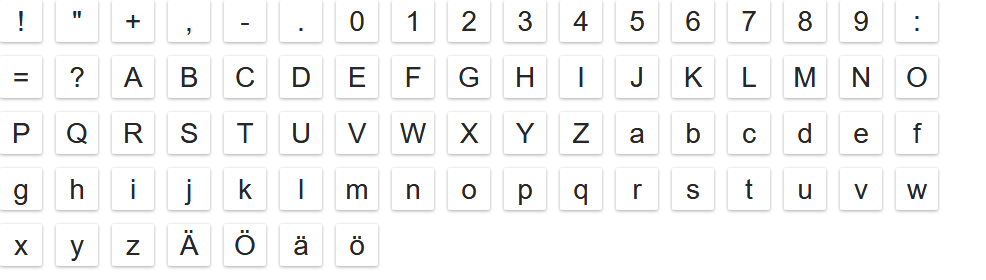
Back to Calligraphr! I created a new template, and the list of glyphs of version 2 of Version 2 is in the image above. To make space for all letters, I removed some special characters, such as the parentheses and @. Goodbye, @, maybe one day we’ll get each other… Well, to be honest, I don’t need you and the others that much. Nowadays, I use other fonts to write all other materials and keep the comics font to comics alone. However, you should notice that I also removed, very intentionally, the apostrophe ‘, and that’s going to bite me in the butt later on.

In addition to changing the template, I tweaked the characters a little.
(By the way! When I was checking what apostrophe is in English, I found this Wikipedia page where you can read how quotation marks are used in each language! I love it!)
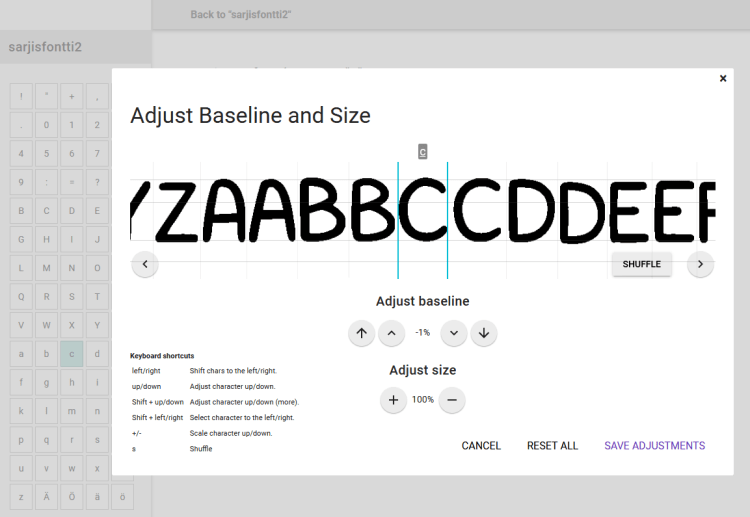
This time, I actually made it to the font edit phase. This is a boring, tedious and repetitive phase which I thoroughly enjoy because I love nitpicking.

In Calligraphr, it is possible to enable randomization of your font. That is, you can draw and add alternative characters so that when there’re two same characters in a word next to each other, for example the t’s in lottery, the t’s will look different from one another. This makes the text look more natural and less monotonous and robotic. Unfortunately, the alternative characters should apparently be included in the 75 glyphs available in the free version, so I was not able to use that feature.
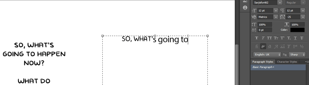
After adjusting everything, I downloaded the font, opened Photoshop and started to write a comparison paragraph. The first sentence was “So, what’s going to happen now?” And in the second sentence… yes, there’s an apostrophe! I do indeed need the hecking apostrophe!
*sigh* Back to the drawing board.
Fortunately, because the first template already had a slot for the apostrophe, I didn’t have to create a third template but was able to upload just that one character to Calligraphr.
4. Finished
Next: a comparison of the original and new font!

Thus, Sarjisfontti2 was born! Getting used to the new font will take some time, but I believe that Sarjisfontti2 will greatly improve my comics.

Subscribe to my newsletter to stay up-to-date of my comics.
Eelis Nilukka is a comic artist from Finland. His most well-known works are webcomics BSandL and Summertime and a short story Boys Can Wear Make-Up Too.
